In this blog, we will learn about How to Make a Website Responsive in Just 15 Minutes. Yes this is true you can create a responsive website just in 15 min but before that you just need a basic knowledge of HTML, CSS and JavaScript.
Firstly you need to understand What is a Responsive Website? Basically the websites or web apps that can work on any device or cross-platform.
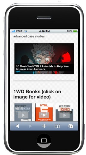
Our Goal is to make a website likethis

It fairly easy to clone the image as seen above, but the main goal here is to make it responsive. To make the website respond based on the size of your device’s screen size.
Before moving on, download the Foundation Web Framework and unzip it to a folder where all of your files for this tutorial will be located. It should look like this:
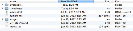
Open index.html and see several elements blasted in one page as a demo. We won’t use everything you will see in it, but you can learn a lot from it. Now, delete it or move it somewhere else so that we can start from scratch.
Our goal is to create a website which has the basic areas of a website: header, body, sidebar, and footer. Of course, everything will be responsive, from images down to text and elements placement.
Step 1
First, you need to understand a few things about Foundation and how creating layouts works. It uses 12 columns to define the width of each “section”, which is derived from foundation.css‘ width of 1000px. So, if we write:
<div class="row">
<div class="twelve columns">
<div class="row">
<div class="seven columns">
<div class="row">
<div class="twelve columns"></div>
</div>
</div>
<div class="five columns"></div>
</div>
</div>
For “seven columns” we placed another row inside which occupies “twelve columns”. This means that the “twelve columns” will take the maximum width of “seven columns” and divide it into “twelve columns”. It’s a nest of rows and columns, which is important for our goal layout.
Step 2 Laying out the foundation
Use any text editor reate a file named index.html then add the following at the very beginning of the file:
<!-- Included CSS Files -->
<!--[if lt IE 9]>
<link rel="stylesheet" href="stylesheets/ie.css">
<![endif]--><script type="text/javascript" src="javascripts/modernizr.foundation.js"></script>
<!-- IE Fix for HTML5 Tags -->
<!--[if lt IE 9]>
<script src="http://html5shiv.googlecode.com/svn/trunk/html5.js"></script>
<![endif]-->

Next do the html coding for making frames
<div class="row">
<div class="twelve columns">
<h2>Header Twelve Columns</h2>
</div>
</div>
<div class="row">
<div class="twelve columns">
<div class="row">
<div class="seven columns">
<h2>Body Seven Columns</h2>
</div>
<div class="five columns">
<h2>Sidebar Five Columns</h2>
</div>
</div>
</div>
</div>
<div class="row">
<div class="twelve columns">
<h2>Footer Twelve Columns</h2>
</div>
</div>

Step 3 Add Content to the Website
This step is needed to actually see how the webpage will look in its full glory. Copy some Lorem Ipsum and paste it on your “body” div, then insert images using tag, then you’re on your way to becoming a superstar with this!
The next thing you need to do is study the files you downloaded and start creating your own responsive web page from scratch. I hope now you can create your own responsive website within 15 min but before get your concept clearn in HTML and CSS to learn this visit Easyshiksha.
More News Click Here
New Courses
Opamp Projects: Design & Simulate Operational Amplifier Based Projects on Proteus & LTSpice Software
Biomedical Project: Design Digital Thermometer with Atmega32, Arduino & LM35 Temperature Sensor
Fusion 360 Learn CAD and Earn Money Online
Analog Electronic Lab Based Course on MOSFETs using MULTISIM
Discover thousands of colleges and courses, enhance skills with online courses and internships, explore career alternatives, and stay updated with the latest educational news..
Gain high-quality, filtered student leads, prominent homepage ads, top search ranking, and a separate website. Let us actively enhance your brand awareness.
Download EasyShiksha Mobile Apps from Android Play Store, Apple App Store, Amazon App Store, and Jio STB.
1 million+ learned on the EasyShiksha App
Trusted by Standards & Global Compliance Frameworks


Built under internationally recognized standards for quality, information security, educational excellence and business continuity.
ISO 9001:2015 | ISO/IEC 27001:2022 | ISO 21001:2018 | ISO 22301:2019 | DPIIT Recognized Startup | MSME Registered


