









Join thousands of students achieving their dreams with expert-led courses.
Join free and unlock everything on EasyShiksha.
Takes less than 3 seconds — no password needed
Please enter a valid email address.
Checking your email…
Almost done — just verify your number so we can send course updates and certificates.
Used only for verification & updates
Incorrect OTP. Please try again.
Takes less than 10 seconds
Please select your country.
Please select your state.

Presentations are an important part of academic life. Students use slides to explain research findings, present classroom assignments, discuss case studies, share project outcomes and communicate ideas during seminars. However, a presentation is not effective simply because it contains attractive colours, animations or decorative graphics. It should also make information easy to understand for everyone viewing it.
Some presentations become difficult to follow because they contain small text, poor colour combinations, crowded layouts, unclear diagrams or information communicated only through images. These design choices can create barriers for people with visual, reading or other accessibility needs. They can also make presentations confusing for audiences viewing slides on smaller screens or from a distance.
Accessible presentation design focuses on making information clear, organised and usable by a wider audience. It combines visual hierarchy, readable typography, suitable colour contrast, meaningful images, clear language and thoughtful slide structure.
This guide explains how students can create accessible presentations, identify common design problems and improve their slides through practical techniques.
An accessible presentation is designed so that people with different abilities and ways of accessing information can understand its content as effectively as possible.
Accessibility in presentation design involves more than choosing readable fonts. It includes how information is arranged, how images are described, how colours are used and whether the presentation can be navigated or interpreted using different assistive technologies.
For example, consider a slide containing a complex chart. If the presenter explains the information only through colour differences, some viewers may find it difficult to understand. Adding direct labels, clear legends and a short text explanation can make the same chart easier to interpret.
An accessible presentation generally focuses on:
Readable text and appropriate font sizes
Clear visual hierarchy
Sufficient contrast between text and background
Logical slide structure
Meaningful image descriptions
Simple and understandable language
Charts and diagrams with clear labels
Consistent layouts and navigation
Accessibility features supported by presentation software
The objective is to communicate ideas without creating unnecessary barriers for the audience.
Students prepare presentations for different audiences, including classmates, teachers, external evaluators and online viewers. Not everyone experiences visual information in the same way.
Accessible design can improve the presentation experience for several reasons.
Small text, decorative fonts and crowded paragraphs can make slides difficult to follow. Readable typography and suitable spacing help viewers focus on the information.
Some students understand information more easily through diagrams, while others benefit from written explanations or spoken descriptions. Combining visual and textual information can make a presentation more useful to different learners.
A well-organised slide helps the audience identify the main idea without searching through unnecessary details.
Presentations are often shared through email, learning management systems or online meetings. Accessible formatting can make shared materials easier to read and navigate.
Students who consider accessibility during the design process develop a better understanding of how communication choices affect different audiences.
Visual hierarchy refers to the way design elements are arranged to show which information deserves attention first.
When viewers open a slide, they should be able to identify its main message quickly. A clear title, supporting points and relevant visuals can guide their attention.
Title: Communicates the main subject of the slide.
Subtitle: Provides additional context or explains the purpose of the content.
Main Content: Presents the most important information, such as key points, findings or explanations.
Supporting Visuals: Includes charts, icons, illustrations or photographs that help explain the subject.
Source or Reference: Identifies the origin of information when required.
Imagine a student is preparing a presentation about renewable energy.
A poorly organised slide might contain a large paragraph, several unrelated images and multiple headings with similar formatting.
A clearer slide could follow this structure:
Title: Types of Renewable Energy
Main visual: A labelled diagram showing different energy sources
Supporting points: Solar, wind and hydropower
Short explanation: One or two sentences about each source
Source: Relevant reference for the information or visual
The audience can understand the subject more easily because the content follows a logical order.
Typography refers to the way text is selected and presented through font style, size, weight, spacing and arrangement.
The choice of typography affects how easily viewers can read presentation content.
Students should avoid using too many decorative fonts or changing text styles without a clear purpose.
Choose simple and readable fonts.
Use consistent font styles throughout the presentation.
Make slide titles visibly different from body text.
Avoid very small text.
Use bold formatting selectively to highlight important information.
Maintain sufficient spacing between lines and paragraphs.
Avoid writing long paragraphs in uppercase letters.
Do not use decorative fonts for important instructions or explanations.
For most academic presentations, a simple font family with consistent heading and body-text styles is a practical starting point.
| Slide Element | Suggested Treatment | Purpose |
|---|---|---|
| Main Title | Larger, bold and clearly positioned | Identifies the slide topic |
| Section Heading | Medium-sized and distinct | Separates different ideas |
| Body Text | Readable and consistently formatted | Explains the main content |
| Supporting Note | Smaller but still legible | Provides additional context |
| Source Reference | Clearly positioned and readable | Identifies the information source |
The exact font size should depend on the presentation format, screen size and viewing distance. Students should test their slides in presentation mode rather than judging readability only on a laptop editing screen.
Colour plays an important role in visual communication. It can separate sections, highlight important information and make a presentation visually engaging.
However, using many colours without a clear purpose can create confusion.
One common accessibility problem occurs when text and background colours are too similar. For example, light grey text on a white background may be difficult to read.
Contrast refers to the visual difference between two elements, such as text and its background.
A presentation should maintain enough contrast to make important information distinguishable.
Consider these examples:
Dark text on a light background
White text on a dark background
Dark blue text on a pale background
The suitability of a colour combination depends on its actual contrast, text size and presentation conditions.
Imagine a slide showing examination results using green for passed students and red for students who need improvement.
Some viewers may not distinguish the colours easily. Instead of relying only on colour, add text labels such as "Passed" and "Needs Improvement."
This approach communicates the same information through more than one visual method.
| Design Element | Better Practice | Common Problem |
|---|---|---|
| Text and Background | Use clearly distinguishable colours | Similar shades reduce readability |
| Highlighted Information | Combine colour with labels or formatting | Colour is the only indicator |
| Charts | Use distinct colours and direct labels | Several similar shades are difficult to identify |
| Background | Keep it simple and consistent | Busy patterns compete with the text |
| Links | Make links identifiable through text or additional formatting | Link meaning depends only on colour |
Students can also use online colour-contrast checkers to review combinations before presenting their slides.
Images, icons and diagrams can make presentations more engaging, but every visual should support the message.
Adding unrelated pictures simply to fill empty space can distract the audience.
Students should select visuals based on their relevance to the slide topic.
A photograph of a laboratory may support a presentation about scientific experiments. However, an unrelated decorative image does not necessarily improve understanding.
Alternative text, often called alt text, is a written description that communicates the purpose or relevant information of an image to people who may not be able to see it.
For example:
Image: A labelled diagram showing the stages of the water cycle.
Useful alternative text: "Diagram showing evaporation, condensation, precipitation and collection in the water cycle."
Alternative text should explain the important information conveyed by the image rather than simply describing its appearance.
Decorative images that do not add meaningful information can often be marked as decorative using the accessibility options available in presentation software.
When important information is placed inside an image, some viewers may not be able to access it easily.
Whenever possible, use actual editable text for headings, labels and explanations instead of embedding all the information in a picture.
Charts and graphs are useful for explaining numerical information, research results and comparisons.
However, a chart can become difficult to understand if it contains unclear labels, tiny text or too many visual elements.
Students should make sure that charts communicate their message without requiring viewers to guess what each section represents.
Give every chart a descriptive title.
Label axes clearly.
Include units wherever necessary.
Use readable text.
Avoid overcrowding the chart.
Use direct labels where practical.
Do not rely only on colour to distinguish data.
Add a short written explanation of the main finding.
Imagine students conduct a survey about preferred methods of learning.
The results show the number of participants who prefer classroom learning, recorded lectures and practical activities.
Instead of displaying a chart without explanation, the slide should include:
A clear chart title
Labels for each learning method
The number of responses
A suitable chart legend, if required
A short statement explaining the main observation
This makes the chart easier to interpret even when someone does not immediately recognise every visual element.
| Chart Element | What to Include | Why It Helps |
|---|---|---|
| Chart Title | A clear description of the data | Explains the purpose |
| Horizontal Axis | Category names or time periods | Identifies the groups being compared |
| Vertical Axis | Values and units | Explains the numerical scale |
| Data Labels | Values where useful | Reduces the need to estimate |
| Legend | Clear descriptions of data series | Explains different data groups |
| Text Summary | A short explanation of the main finding | Provides an alternative way to understand the result |
Accessible presentations should use language that the intended audience can understand.
Long sentences, unexplained technical terms and unnecessary jargon can make slides difficult to follow.
Students should organise content around one main idea at a time.
Instead of placing a complete textbook paragraph on a slide, identify the key information and present it in a structured way.
For example:
Less effective:
"Photosynthesis is a complex biological process through which green plants utilise sunlight, carbon dioxide and water to synthesise carbohydrates while releasing oxygen as a by-product."
More presentation-friendly:
"Photosynthesis is the process through which green plants use sunlight to make food.
Requires light energy
Uses carbon dioxide and water
Produces carbohydrates
Releases oxygen"
The second format makes the main information easier to scan. A detailed explanation can be provided verbally or in supporting notes.
If a presentation includes specialised words, provide short explanations where necessary.
For example, a presentation about computer networking may introduce the term "bandwidth." A brief definition can help viewers who are unfamiliar with the concept.
Organise slides so that the audience can follow the subject from introduction to conclusion.
A typical academic presentation may include:
Title and introduction
Background or context
Main concepts
Evidence, examples or analysis
Key observations
Conclusion
References
The structure should be adjusted according to the topic and assignment requirements.
Navigation helps viewers understand where they are within a presentation and how its content is organised.
Students can improve navigation by using consistent slide titles, section headings and layouts.
A title such as "Results" may be suitable in some contexts, but a more descriptive title can communicate the main point more clearly.
For example:
General title: Results
Descriptive title: Survey Responses Show a Preference for Practical Learning
A descriptive title gives the audience useful context before they examine the rest of the slide.
Use a consistent approach for:
Slide titles
Heading styles
Backgrounds
Page numbers, where appropriate
Image placement
Section dividers
References
Consistency makes the presentation feel organised and reduces unnecessary visual changes.
Slide numbers can help students and audiences refer to particular sections during discussions or question-and-answer sessions.
For longer presentations, section divider slides can also help viewers understand the overall structure.
Modern presentation tools include features that can help students identify and improve accessibility problems.
The available features depend on the software and version being used.
Students using Microsoft PowerPoint can explore its Accessibility Checker to identify certain issues, such as missing alternative text or reading-order concerns.
Other useful features include:
Adding alternative text to images
Using built-in slide layouts
Checking reading order
Using accessible themes
Reviewing colour contrast
Adding captions to supported media
Google Slides provides options for organising slide content and working with accessibility-related features.
Students can use:
Built-in layouts
Clear titles and headings
Speaker notes
Alternative text for images
Captions during supported presentations
Keyboard navigation
Canva offers design templates and visual editing tools that can help students organise presentation content.
When using Canva, students should still review the final slides for:
Text readability
Colour contrast
Image descriptions where supported
Clear visual hierarchy
Logical content structure
A template may look attractive, but it should not automatically be considered accessible. Every presentation needs a separate review.
Students sometimes focus so much on appearance that they overlook the audience's ability to access the information.
The following table highlights common problems and practical ways to address them.
| Common Mistake | Why It Creates a Problem | Recommended Improvement |
|---|---|---|
| Very small text | Makes content difficult to read | Increase text size and reduce unnecessary content |
| Low colour contrast | Reduces text visibility | Choose more distinguishable text and background colours |
| Too many fonts | Creates visual inconsistency | Use a limited and consistent font system |
| Unlabelled charts | Makes data difficult to interpret | Add titles, axis labels and explanations |
| Images without descriptions | Important visual information may be inaccessible | Add meaningful alternative text |
| Colour-only indicators | Some viewers may not distinguish the information | Add text labels or patterns |
| Long paragraphs | Makes slides difficult to scan | Divide information into short sections |
| Inconsistent layouts | Makes navigation less predictable | Use consistent slide structures |
| Unnecessary animations | Can distract viewers or make content harder to follow | Use motion only when it supports the explanation |
Students can develop their presentation-design skills through a simple before-and-after exercise.
Objective: Identify accessibility problems in a sample presentation and redesign the slides to make them clearer and easier to use.
Materials Required:
A sample presentation with common design problems
Presentation software
A checklist
A computer or laptop
Choose a presentation containing issues such as small text, poor contrast, crowded paragraphs, unclear charts or missing image descriptions.
Review each slide and record the design issues.
Make changes to typography, spacing, headings, colours and visual organisation.
Add meaningful alternative text to informative images and improve chart labels.
Ensure that headings follow a logical order and that the content is organised consistently.
View the presentation in full-screen mode and check whether its content is readable and understandable.
| Review Area | Questions to Ask | Status |
|---|---|---|
| Typography | Is the text readable? | Yes / No |
| Colour | Is there sufficient contrast? | Yes / No |
| Images | Do informative images have descriptions? | Yes / No |
| Charts | Are the titles and labels clear? | Yes / No |
| Content | Are sentences understandable? | Yes / No |
| Navigation | Are slides organised logically? | Yes / No |
| Consistency | Are layouts and headings consistent? | Yes / No |
| Software Check | Have available accessibility tools been used? | Yes / No |
Learning Outcome:
After completing this activity, students should be able to recognise common accessibility barriers, apply basic design improvements and evaluate their presentations from the audience's perspective.
Accessible presentation design is relevant to more than graphic design. It can support communication across different academic disciplines.
Students studying computer science can apply accessibility principles to user interfaces, websites, dashboards and digital applications.
Business and management students can use accessible presentations to communicate research, business proposals, operational plans and performance information.
Students interested in teaching and education can apply inclusive presentation practices while preparing classroom materials and digital learning resources.
Media and communication learners can explore how typography, images, layout and visual storytelling influence the way information is understood.
Graphic design and UI/UX learners can use accessibility principles while developing posters, digital interfaces, infographics and presentation layouts.
Students interested in developing these skills can explore Design courses on EasyShiksha and Design Tools courses.
Presentation design can contribute to a broader set of creative and communication skills.
Students who enjoy organising information visually may explore learning opportunities in areas such as:
Graphic Design
UI/UX Design
Visual Communication
Presentation Design
Digital Content Creation
Information Design
Multimedia Design
Educational Content Development
These areas have different skill and qualification requirements. Presentation design can be one component of a broader portfolio rather than a complete professional qualification by itself.
Students interested in exploring visual communication as an academic specialisation can also browse Graphic Design programmes on EasyShiksha.
Before submitting or delivering a presentation, students can use this checklist to review their work.
Does every slide have a clear and meaningful title?
Is the text readable in presentation mode?
Are fonts and heading styles consistent?
Is there sufficient contrast between text and background?
Is important information communicated through text as well as colour?
Are informative images provided with meaningful alternative text?
Are charts and diagrams clearly labelled?
Is the slide content organised logically?
Have unnecessary paragraphs and decorative elements been removed?
Have available accessibility-checking features been used?
Can the presentation be understood without depending only on visual effects?
Have the slides been reviewed before sharing?
Creating an accessible presentation is an important communication skill for students. It requires more than selecting attractive templates or adding decorative visuals. Students need to consider how information is organised, how text is displayed, how colours are used and whether images and charts communicate their meaning clearly.
By applying visual hierarchy, readable typography, suitable contrast, meaningful alternative text and consistent layouts, students can make their academic presentations easier to understand and navigate.
These principles are also useful beyond classroom assignments. They can support the development of digital content, educational materials, business presentations and user interfaces.
The next time you prepare a presentation, review it from the audience's perspective. Ask whether someone viewing it on a small screen, using assistive technology or encountering the subject for the first time can understand the information. Designing with that question in mind is a practical first step towards more inclusive communication.
More News Click here








Discover thousands of colleges and courses, enhance skills with online courses and internships, explore career alternatives, and stay updated with the latest educational news..

Gain high-quality, filtered student leads, prominent homepage ads, top search ranking, and a separate website. Let us actively enhance your brand awareness.
Download EasyShiksha Mobile Apps from Android Play Store, Apple App Store, Amazon App Store, and Jio STB.
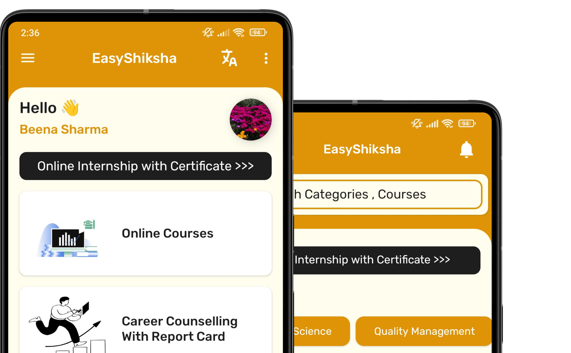


1 million+ learned on the EasyShiksha App
Trusted by Standards & Global Compliance Frameworks





Built under internationally recognized standards for quality, information security, educational excellence and business continuity.
ISO 9001:2015 | ISO/IEC 27001:2022 | ISO 21001:2018 | ISO 22301:2019 | DPIIT Recognized Startup | MSME Registered